Configuration
The Transition Settings section in the Creative Slider Block sidebar provides controls to fine-tune how your slides transition.
Speed
Ajust the slider control to determines how long the transition between slides lasts, measured in milliseconds (ms).

Loop
The Loop feature allows your slider to continuously cycle through slides. When the toggle is on, the slider will automatically restart from the first slide after reaching the last slide, creating a continuous loop. To disable the loop, switch the toggle back to the off position. In this case, the slider will stop when it reaches the last slide.
Looping allows for a more dynamic user experience, as the slider continuously cycles without any interruption.

Autoplay
Switch the Autoplay toggle to the on position to enable automatic transitions between slides. With autoplay enabled, the slider will begin cycling through slides without any need for manual interaction.
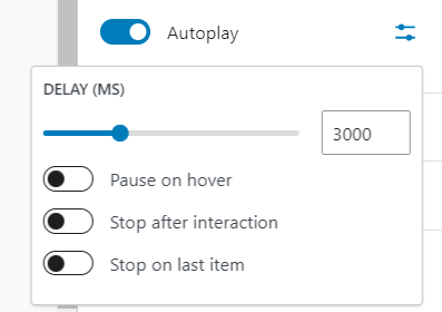
Additional options to fine-tune how autoplay behaves are accessible by clicking the settings icon :
Pause on Hover
When this option is enabled, the autoplay will pause when the user hovers their mouse over the slider. This can be useful for allowing users to focus on a specific slide without the slider automatically progressing.
Stop After Interaction
When enabled, this option stops the autoplay after the user interacts with the slider (e.g., clicking next or previous arrows, manually scrolling through slides). After interaction, the slider will no longer advance automatically.
Stop on Last Item
This option ensures that autoplay stops when the slider reaches the last slide. The slider will no longer loop back to the first slide automatically.
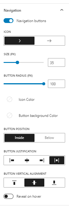
Navigation
The Navigation panel allows you to control the appearance and behavior of navigation buttons for your slider. Once Navigation Buttons toggle is enabled, several customization options become available.
-
Icon: Allows you to select the navigation icons.
-
Size: Adjusts the size of the navigation arrows. Use the slider to change the size of the arrows in pixels (px).
-
Button Radius: Adjusts the corner radius of the buttons around the navigation arrows. Use the Button Radius slider to set the corner radius in pixels. A higher value creates more rounded corners, while a value of 0 gives sharp, square corners.
-
Icon Color and Button Background Color: Allow you to customize the colors of both the icon (arrows) and the background of the buttons. Click on the color pickers to select the desired colors.
-
Navigation Position:
- Button Position: Allows you to position the navigation buttons either Inside the slider container or Below the slider.
- Button Justification: Controls how the navigation buttons are aligned horizontally within the slider.
- Button Vertical Alignment: Adjusts the vertical alignment of the navigation buttons.
-
Reveal on Hover: When enabled, the navigation buttons will only appear when the user hovers over the slider.
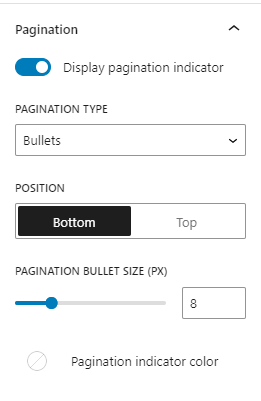
Pagination
The Pagination panel gives you control over how the slider's pagination indicators are displayed and customized. Pagination helps users understand which slide they are on, and provides an additional way to navigate through the slides.
-
Pagination Type: Allows you to choose the style of the pagination.
- Bullets: Displays small bullet indicators, one for each slide. Users can click on these bullets to navigate to the corresponding slide.
- Progress: Displays a progress bar that fills up as users move through the slides.
-
Position: Allows you to choose whether the pagination appears at the Bottom or the Top of the slider.
-
Pagination Bullet Size and Progress Bar Size: Adjusts the size in pixels (px) of the pagination indicators, whether you’re using bullets or a progress bar.
-
Pagination Indicator Color: Allows you to customize the color of the pagination bullets or the progress bar.
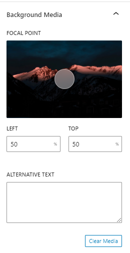
Slider Background
You can add a background media element (image or video) to the entire slider, which enhances the visual appearance and adds depth to your slider content.
Adding a Background Media
- In the toolbar of the Creative Slider Block, click on Add Media. You’ll be prompted to either upload new media from your computer or select media from the Media Library. Choose the media you want to use as the background for your slider.

-
Click Replace Media in the block toolbar to select a new media.
-
Once you’ve added background media, further customization options are available in the Background Media section of the block sidebar:
-
Use the Focal point picker to specify the main point of interest in the image and highlight it. This is helpful to ensure that the key area remains visible regardless of how the background is scaled.
-
In the Alternative Text text field, you can write an Alternative Text description, which is important for accessibility and SEO.
-
Click Clear Media to remove the image or video.
-
Enabling Parallax Effect
toggle Enable parallax effect to add a dynamic visual movement to the background as the slider transitions. The background media will move in relation to the progress of the slider, creating a parallax scrolling effect.
The Parallax Movement option allows you to control how much the background moves in response to the slider’s progress. Change the slider to adjust how far the background should move. Larger value in pixels (px) results in greater movement.
